Vitaliv
🇧🇷 PT-BR
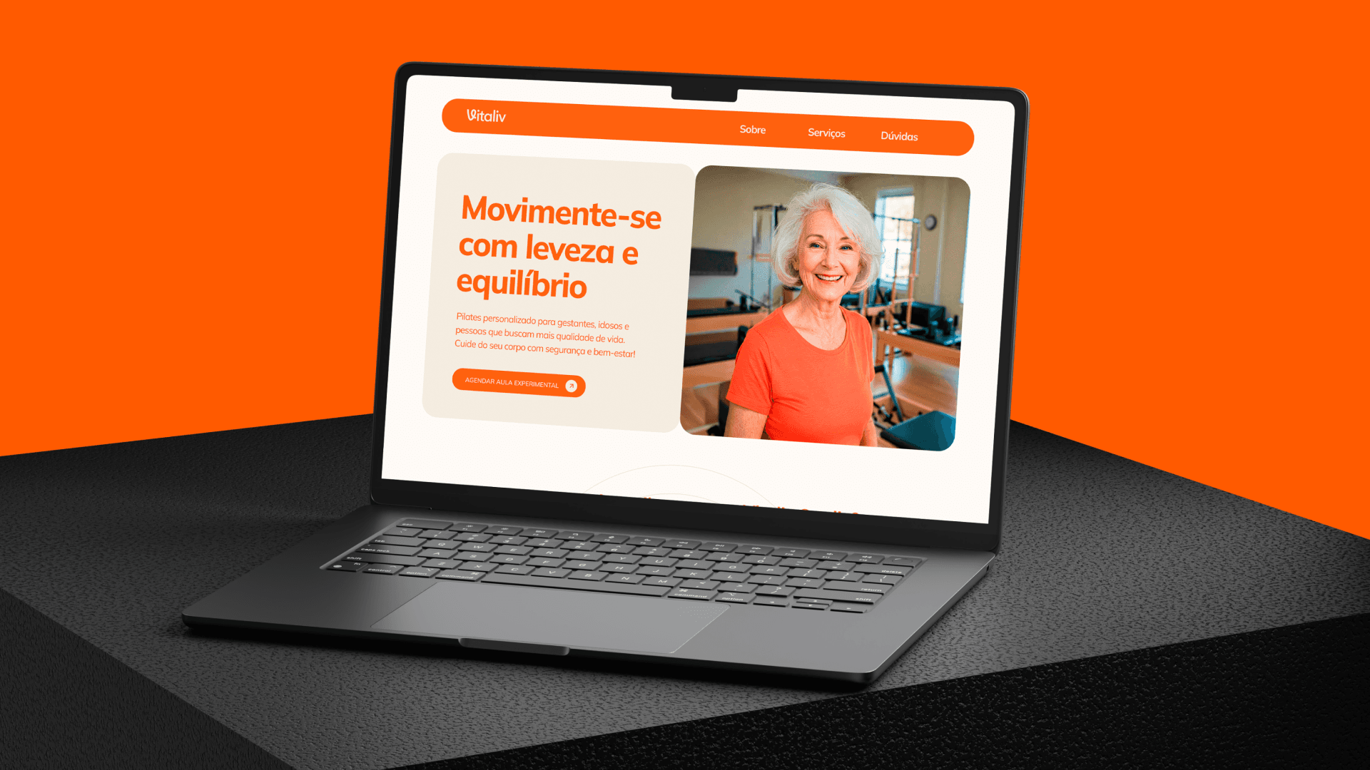
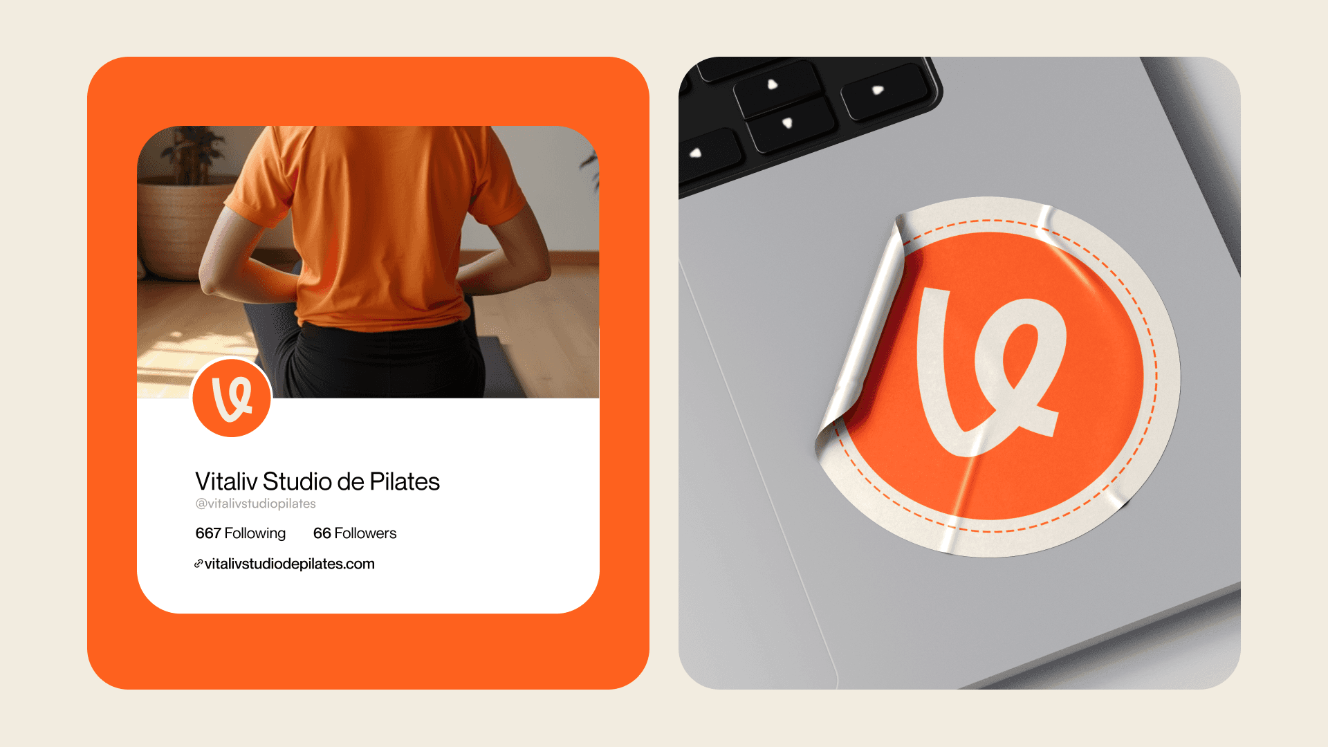
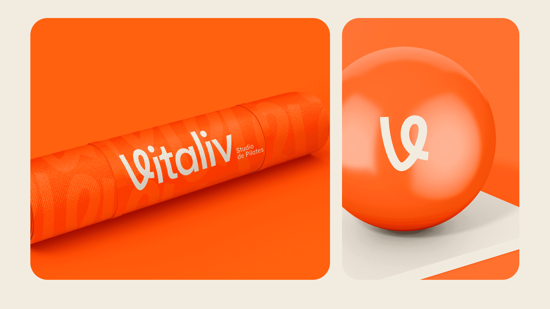
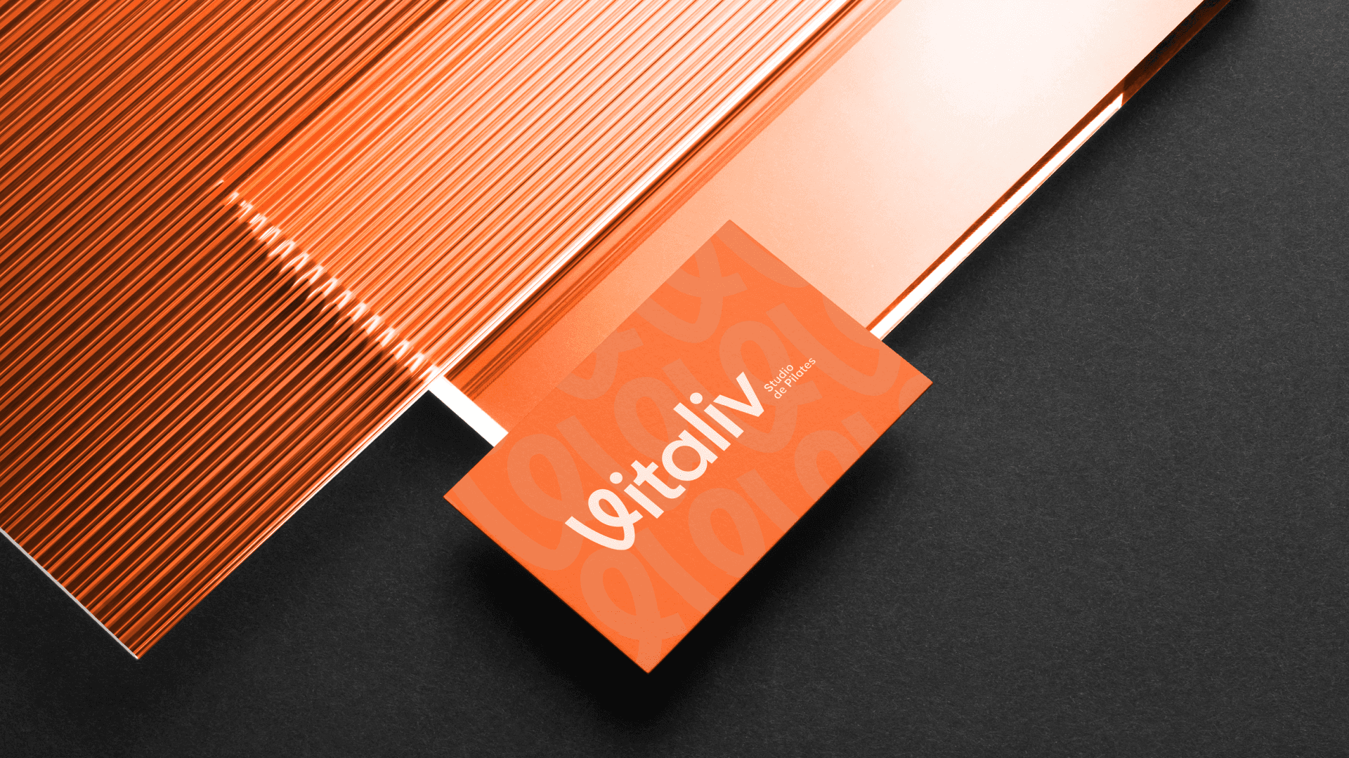
A identidade visual do Vitaliv Studio de Pilates nasceu com uma proposta tradicional, mas evoluiu ao perceber que o nome — forte, simples e memorável — era seu maior diferencial, refletindo bem-estar e vitalidade.A paleta em laranja e bege equilibra energia e movimento com aconchego e tranquilidade, traduzindo a essência do pilates. O V em destaque reforça o nome e permite variações versáteis para a marca. Com tipografia desenhada à mão, a identidade ganha autenticidade e proximidade, criando uma conexão real com o público e fortalecendo o posicionamento do estúdio.
🇺🇸 EN
The visual identity of Vitaliv Pilates Studio started traditionally but evolved as the strength of the name — bold, simple, and memorable — became clear, reflecting wellness and vitality. The orange and beige palette balances energy and movement with warmth and calm, echoing the essence of Pilates. The highlighted V reinforces the name and brings versatile design options. With hand-drawn typography, the brand gains authenticity and approachability, creating real connection and strengthening the studio’s market presence.
Live Project